 Things I loved (and still do) - the cabinets and the cabinet space, the openess, the double ovens (sooo nice to have), and the gas cooktop stove. Things I didn't love - the wall color, white appliances, and the laminet countertops.

What we did: Painted the walls (we took the paint color that was in the family room and extended it into the kitchen), added stainless steel appliances, granite countertops, and rug from Target to add some color.
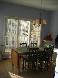
The breakfast nook didn't need much work. Here is what it looked like before...
And after...
I prefer dark wood so we added a dark wood table that we got at a local furniture store, baker's rack from Pier One and a mirror that was in our old condo. I also added a Target rug that matches the runner in the kitchen and red nesting tables in the corner (you can't see) from Pottery Barn that was a gift from my aunt and uncle.
And finally the family room. What I love about this house is that evertrhing is so open. The family room is right off the kitchen and everything flows perfectly. This room probbaly had the least amount of work. Here is what it looked like before...
And after...
All we had to do in this room was add our furniture. The couches are from our old condo, pillows/blanket are from Target. The prints above the couch are from Crate and Barrel. The TV stand was a larger purchase from Pottery Barn. Right now above the TV and empty wall and it looks empty. I'm not sure what to do. Any suggestions??


4 comments:
Your home is beautiful! We have been in our house for 5 years and I'm still learning the best layout and organization!
Thanks Joy! I'm sure a lot of things will change in our layout once we have kids. Right now its easy since it is just me and my husband.
Hey Christina-
As far as the wall looking empty over the TV stand, you could always buy a TV frame from Pottery Barn. It looks like a giant picture frame and you mount it up on the wall surrounding the TV (this would, of course, require you to mount the TV and a frame...but it could be worth it).
Here's a link so you can see what I'm talking about: http://www.potterybarn.com/products/p8176/index.cfm?pkey=xsrd0m1%7C20%7C%7C%7C0%7C%7C%7C%7C%7C%7C%7Ctv%20frame&cm%5Fsrc=SCH.
There was one on sale at the Tyson's PB last time I was there too, btw.
I loved looking at the before and after pictures! Especially because the after ones were very impressive. When I get my own place I know I'll have a field day planning out changes in the decorating and such, so this was a lot of fun to see.
Post a Comment