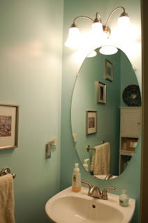
The paint was too dark, the fixtures were all brass. The whole thing just wasn't our style. We repainted, changed all the fixtures to brushed nickel, and added a few decorative touches. The whole things was done from stuff at Home Depot, Target, and Etsy. Here's what it looks like now-


15 comments:
I love it!! It looks great!
LOVE that over-the-toilet cabinet!! I wanted one in our place but there is a towel rack over the toilet and since we're renting I'm not sure we can take it down. Great job!
Yay! Everything looks great!
It looks fantastic! I love the new fixtures and the white cabinet. This is next on my list of house projects.
Looks great! Like the new color and details. Great job!
That looks awesome!
very nice!! I love the wall color, it looks so much bigger and brighter!
Love it!!
Small spaces are so much easier to do than larger ones (I.e. living rooms). It's easy to make it look like a major overhaul. Very cute!
I love it! My hubby I have been been wanting to make some cosmetic changes to our master bath (but have done nothing thus far). You just gave me inspiration!
~Britta
Looks great! LOVE the color of the walls. :)
It looks great ....love the color!
It looks so nice!
its my favorite place in the house......
oooh very nice!
Post a Comment